Evacuation sign “Direction to the emergency exit to the right” is a safety sign, used as a pictogram for an illuminated evacuation sign. The size of the E03 evacuation sign is selected taking into account the size of the light indicator board. An evacuation sign is installed on the walls of the premises.
The evacuation sign “Direction to the emergency exit” is made on white self-adhesive film and meets the requirements of GOST 12.4.026-2015.
At the request of the customer sign E03 can be manufactured in a different size or on a different base. The base material is white self-adhesive film, transparent self-adhesive film, photoluminescent self-adhesive film or plastic.
PRICE FOR EVACUATION SIGN - DIRECTION TO EMERGENCY EXIT TO THE RIGHT
For orders over 10 thousand rubles, special prices apply. Before placing an order for safety signs, we recommend that you read the section “ Illuminated signs» and choose the optimal solution taking into account the requirements of your facility.
HOW TO ORDER AND BUY E03 SIGN
To quickly place an order, use the shopping cart. When placing an order, you will only need to provide contact information. Our manager will check availability, price, delivery times and contact you. You will receive a response within one business day. Payment for your order is carried out by bank transfer.
How to correctly indicate the direction of movement on an evacuation plan?
How should the direction of movement to an emergency exit be correctly indicated on evacuation plans? Today there are two common opinions:
- Arrow
- Sign E-03 or E-04 (Direction to the emergency exit to the right/left) according to GOST R 12.4.026-2001
What does ND say? Nothing. GOST R 12.2.143-2009 does not regulate how to correctly indicate the direction of movement. That's why there are disagreements.
I believe that an arrow should be used. Why? I propose to consider this issue in detail from theoretical and practical points of view:
Theoretical justification - how the direction of movement should be indicated.
Arguments in favor of the sign:
GOST R 12.2.143-2009 determines that “colorographic images of safety signs... on evacuation plans must comply with the requirements of GOST R 12.4.026-2001.” Studying the following requirement - “Evacuation routes leading to the main emergency exits should be marked with a solid green line indicating the direction of movement” - some developers see in it some kind of phonetic connection with the semantic meaning of the sign E-03 or E-04 (“Direction to the evacuation exit right/left"), based on the mention of the word "direction". Based on such vague similarity of wording, the developers believe that this very “direction of movement” should be designated with the sign E-03 or E-04. There is some justice in this theoretical approach, but at the same time there is also a contradiction: if you fully follow the rule of depicting the direction of movement using signs whose semantic meaning contains the word “direction,” then it would be logical to use all the signs in a row from E-03 to E-12, because each of them has an indication of a specific direction of movement “left” or “right”, “up” or “down”:

Moreover, on straight sections (for example, along corridors), the direction of movement should be indicated precisely through the sign E-11 and E-12, if we proceed directly from its meaning “Direction straight to the emergency exit.” But for some reason no one does this. The developers believe, for some incomprehensible reason, that signs E-03 and E-04 are quite sufficient to indicate the direction of movement in any direction. Let's see how it would be necessary to indicate the direction of movement if we follow the mentioned logic to the end. So, let's say there is a room like this:

This is how we can depict, using arrows and line graphics, which direction a person should turn to get to the exit from any room:

This is what it looks like using only the E-03(04) sign:

And this is what it would look like if you follow the mentioned logic to the end:
In my opinion, such a diagram cannot be read so easily. Moreover, look at the difficulties that arise when turning the green line of the evacuation route, especially where several lines intersect. One thing is reassuring that no one does this.
The main argument in favor of a sign to indicate the direction of movement is that GOST R 12.2.143-2009 directly refers to GOST R 12.4.026-2001, which contains a description of the signs mentioned and the fact that this GOST regulates the use of these same signs. Yes, this is obvious, but completely untenable as evidence, since we are only talking about compliance with the icons applied on the evacuation plan. The question remains: should the E-03 and E-04 symbols be used when developing an evacuation plan?
There is an opinion that sign E-03(04) is more visual when perceiving an evacuation scheme. In my opinion, this is controversial, because this sign was developed with the aim of guiding people during their actual movement along the corridors of the building, which means it was conceived in a large design, allowing it to be placed on it in a readable form, a fairly developed pictogram of three elements: not too a sporty looking running man, an arrow and a schematic image of a door. With a minimum permissible sign height of 5 cm (Table 3 GOST R 12.4.026-2001), such a “comic” is really quite readable from a distance of no more than a meter. It must be remembered that it will be read without interference from any extraneous graphics, since it will be placed on a free wall so that it best fulfills its role - indicating the direction. Now let’s remember the maximum height of the sign on the evacuation plan of 1.5 cm, and also imagine a rather complex and large room with a confusing layout, which requires constant clarification of the direction of movement, and imagine how easy it will be to read:

In favor of the arrow:
The arrow is also supported by the fact that GOST R 12.2.143-2009 directly refers to GOST 28130: “If it is necessary to specify the features (technical characteristics) of fire protection means indicated on evacuation plans, it is allowed to use conventional graphic symbols in accordance with GOST 28130,” in which contains a recommendation in the form of Table 3, which most clearly and unambiguously shows which symbol should indicate “Evacuation route, direction of travel,” as well as “Evacuation route, exit.”
Table 3
We see that GOST R 12.2.143-2009 equally refers to both GOST 28130 and GOST R 12.4.026-2001, and precisely in the section that sets out the requirements for the graphic part of the evacuation plan.
There is an opinion that GOST 28130 cannot be used to borrow any symbols from it, except for conventional graphic symbols of fire extinguishers, fire extinguishing installations and fire alarms, because this limits its scope of application. On the one hand, this is fair. But on the other hand, GOST R 12.4.026-2001 also has a completely different scope, and the document never mentions that it should be used when developing evacuation plans. Why is it used? Because GOST R 12.2.143-2009 refers to it, requiring that fire safety signs and safety signs comply with it. But in the same way, GOST R 12.2.143-2009 also refers to GOST 28130, proposing to borrow “fire protection” signs from it if it is necessary to specify them. In my opinion, there is an obvious need to specify the sign (symbol) of the direction of movement, and Table 3 of GOST 28130 copes well with this. Although the traffic direction sign is not exactly a “fire protection” sign. Returning to the counter-argument that the scope of GOST 28130 does not extend to evacuation plans, and most importantly, does not regulate any other graphic images other than signs of fire extinguishers, fire extinguishing installations and fire alarms, even if we agree with such a legal restriction, then in this case we are all We can equally use the symbols from Table 3 simply due to the fact that there is no other document that would also clearly define how the direction of movement (direction of travel) should be indicated on evacuation plans. Therefore, there will be no contradiction or any violation here.
As for the wording “direction of movement” to which the developers appeal, using signs E-03 and E-04 as the closest in meaning, then again the semantic meaning of these signs differs from the problematic phrase and sounds literally like this: “Direction to the emergency exit.. ." Please note that the semantic wording of the arrow “... direction of travel” is significantly closer to the desired phrase “direction of movement”, in contrast to the semantic meaning of sign E-03 “direction to the emergency exit”.
In addition, “direction of movement” and “direction to an emergency exit” are generally different concepts, unlike the synonymous “direction of movement” and “direction of travel.”
As a result, as we see, from a theoretical point of view, all arguments have, in principle, very shaky foundations and a slight advantage in favor of the arrow can be compensated by the fact that in the previous edition of GOST R 12.2.143-2009 (R 12.2.143-2002 ) there was an application with an example of how to make an evacuation plan. And the signs E-03 and E-04 were used as traffic direction indicators.

Before 2009, this was a serious argument, but today such an application no longer exists. And I believe that this is primarily due to the fact that the example was compiled with obvious shortcomings, which practice has revealed over 7 years. Even with a strong desire, the use of signs E-03 and E-04 in evacuation plans to indicate the direction of movement leads to very serious problems in complex premises that call into question the rational benefit of the plan itself. To understand this you need to turn to practice.
Practical rationale - how to indicate the direction of movement.
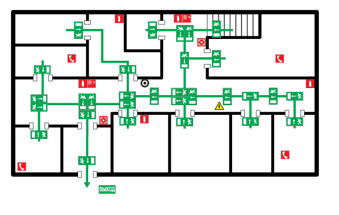
So, let's start simple. Let's take one large room with one emergency exit, a fire extinguisher inside and an alarm button. Everything is simple here:

Now let’s imagine that this is just one of the rooms on the floor, we will increase the number of emergency exits and increase the number of corridors, let’s say that this is a concert hall::

Let's add the necessary texts:

Since this is a concert hall, let’s remember the requirements of international normative documents and duplicate the text in English:

As you can see, on the plan with the use of signs troubles are already beginning - and this is just a provincial theater whose number of seats does not reach 200 seats:

But there are also capital theaters with 1000 seats!

We cannot reduce the scale of the plan because we cannot reduce the size of the 8mm icons. If you do not make the icons smaller, then, as can be clearly seen in the previous illustration, they physically do not fit into some rooms.
As a result, the plan does not fit into the 60x40 format.
Let's try to break it down into several sections based on the number of emergency exits:

Of course, we can do whatever we want with our plan, but, as you can see, this still does not save our plan and even in the smallest section the icons overlap each other:

And look how simply and elegantly the problem of overlapping icons is solved and how easy the plan looks if you use the arrow. Even with this scale of the image, the directions of movement to the emergency exits are visible. In addition, we get rid of the need to make sectional plans, and provide the entire room, which certainly improves a person’s spatial orientation.

Our plan retained its practical usefulness and even some graphic aesthetics!

In my opinion, the general argument in favor of the arrow is precisely its rational ease of use and perception. The arrow is, first of all, a commonly used, recognizable sign. As an example of widespread use, road signs include:
Even if you don't know the rules of the road, you can probably still understand the general meaning.
And here are military maps with active use of arrows:

Here is a great example of how an arrow indicates the direction of movement in the form of directional arrows:

You can clearly see which way Glavryba is heading.
But an exceptional example is the familiar sign E-03, the central element of which is also an arrow:

If a person cannot understand, looking at the arrow, in which direction he should run, then I have great doubts whether he will be able to understand the sophisticated graphics of the E-03 sign, compared to the arrow. And in general, to be frank, it is unlikely that a person who remains puzzledly standing looking at the arrow can be helped in any way.
A little history:
Where does the problem of the arrow or sign actually originate and why is it still relevant? The fact is that there are two graphical software packages on the market for creating evacuation plans in semi-automatic mode - SunoCAD Eva and Evacuation Plan. When they were created, they were guided by the GOST R 12.2.143-2002 application, so they initially contained erroneous algorithms. Since then, the software has been widely distributed to fire protection organizations involved in developing evacuation plans (all of which are proudly listed on both programs' websites). Both software products have not been updated since then, continuing to carry incorrect development algorithms. It is likely that this vision will not be eradicated in the near future and the developers of evacuation plans will continue to stick the E-03 sign into evacuation plans as directional signs.
Summarize:
- To date, GOST R 12.2.143-2009 does not regulate how the direction of movement on evacuation routes should be indicated.
- Due to the lack of formulated requirements for how to indicate the direction of movement on evacuation routes, the developer has the right to designate them using those symbols that he considers appropriate. In this case, he should be guided by common sense and logic.
- Developers have the right to defend and justify their point of view regarding which symbol should indicate the direction of movement by appealing to any regulatory and technical documentation.
- Supervisory authorities do not have the right to recognize the evacuation plan as not complying with GOST R 12.2.143-2009 on the sole grounds that the fire inspector’s vision does not coincide with the developer’s vision on the issue of what symbol should indicate the direction of movement.
02/17/2013 Vlad Rachkov.
Please enable JavaScript to view theAt the end of last year, we made emergency exit diagrams in case of fire for two different objects, for the Moscow Department of Education and a very good store of very good men's clothing “Meucci”, located in the Metropolis shopping center in Moscow.
During their development, an interesting old discussion once again arose with fellow firefighters who accepted these works.
At the beginning of our activities, such questions at the level of “arrows or signs” on evacuation plans were not raised at all, since the old regulatory document 12.2.143-2002 contained a very good (albeit frankly advertising) part, namely Appendix B.
Figure 1. Example of indicating the direction to an emergency exit
according to the “old” GOST 2002
These examples were removed from the new guidance document (12.2.143-2009), so it turned out that on the eve of 2015 this sore question “arrows or signs with people” is alive and well. In this article we will try to finally clarify this situation.
So, we have two diagrams of an emergency exit from the building, one with arrows indicating the route of movement, the other with images of “a person running to the exit.”
Which of these evacuation plans is correct from the point of view of compliance with fire regulations we will try to determine in this article.
Indicating the route to the emergency exit is regulated by two fire safety requirements given in the already mentioned 12.2.143-2009. The first of them is this:
.jpg)
And this very direction of movement, or rather the method of indicating it, is still for some reason a controversial point. Although the debate about this makes no sense if you read the following fire safety requirement correctly.
Section 6 of Standard 12.2.143-2009 states:
.jpg)
The question arises whether the words “indicated by fire safety signs...” refer to all four subparagraphs of paragraph 6.2.3 of the specified State Standard or only to the words “rescue and medical communications”. If we talk about the rules of the Russian language, then of course it turns out that evacuation routes and exits, and the locations of fire protection equipment can be designated as you like, because the words about fire safety signs refer only to the specified locations, rescue and medical communications.
.jpg)
Turning to Gosstandart 12.4.026, we will find several ways to designate the route to the emergency exit (Figure 3).
.jpg)
Figure 3. Examples of signs to indicate the direction of movement to emergency exits
It is obvious, given the example of an evacuation plan (see Fig. 1), that according to the developers of State Standard 12.2.143 (both old and new), the evacuation route should be indicated by signs, not arrows. At least due to the fact that in this version of the image it shows exactly the “direction of movement”, which is indicated in its description in the REGULATIVE document!!
Here, supporters of the “shooter” may (and do periodically) have the following argument.
The table (Figure 3) says where the specified image is used - on the walls of the premises. And therefore, supposedly, it cannot be used in evacuation plans. This is not an argument at all and a clear substitution of concepts. The standards (12.2.143-2009) clearly indicate that they apply "COLOR IMAGES" fire safety signs, and not they themselves, and this image must correspond in color and graphics to the table presented in Figure 3, but in terms of place of application, size and material of manufacture they may differ.
And finally, it remains to give one more argument against the arrows. The same GOST R 12.2.143-2009 refers to a very old, but nevertheless valid document: Standard 28130-89 "Fire equipment. Fire extinguishers, fire extinguishing and fire alarm systems. Conventional graphic designations." And, it would seem, not only is it valid, it is also included in full in the order of Rosstandart dated April 16, 2014.

Figure 4. Designation of escape routes (highlighted) according to GOST 28130-89
However, this 1989 document should be used only when clarification and specification of the technical characteristics of those fire fighting equipment (fire extinguishers, fire hydrants) that are indicated on the evacuation plan are required. This limits the use of GOST 28130-89 to its use as an indication of where to go. Thus, it is not applicable specifically for indicating the direction of movement. A similar position is contained in the official training manual of the Russian Ministry of Emergency Situations, dedicated to the development of evacuation plans, to which we provided. In the manual of the State Fire Service Academy of the Ministry of Emergency Situations of Russia (p. 73), it is the color graphic image of this particular sign that is defined as serving to indicate the route, since the only regulatory document containing instructions on the use of simple arrows to indicate the direction of movement is used in accordance with Standard R 12.2.143-2009 only to clarify certain parameters of fire protection systems, and not at all to indicate the direction of movement.
Now, if we had the task of graphically displaying routes during a fire, for example according to ISO 23601:2009, then yes, then the conversation about arrows would have at least some justification. And since we work in a technical regulation system that provides for the implementation of plans exclusively in accordance with GOST, then such a conversation makes no sense.
To summarize, in the existing version of GOST 12.2.143-2009 there is no clear and unambiguous instruction: “use only fire safety signs to indicate the direction of movement,” however, this instruction is in the guidance document 12.4.026. And one more time Soviet standard 28130-89 is applicable only for specifying the characteristics of fire extinguishing agents, then the only normatively correct way to indicate where to go is the image shown in the following figure or its analogue:
.png)
However, these were all regulatory, legal “delights”. If we talk about that, for the implementation of the preventive component of these goals, the question of “arrows or a normatively justified colorographic image” is not important at all. It is not so important how the prophylactic will designate the route of movement, it is important that this route is chosen correctly.
But the tactical goals, according to which the person reading the plan must get out of the building according to it, is a more interesting question. The following reasoning is appropriate here (precisely at the level of reasoning, since something can be proven in this area only by having statistics of survivors thanks to a pre-drawn diagram indicating the route. And such statistics will not appear in the next ten years.
In this case, the orientation of this image on the diagram at the “right” or “left” level should be tied to the location of the evacuation plan in the building itself. Otherwise, you can really reach the point of absurdity. One colleague who advocates “arrows” decided that it was necessary to indicate the direction to the right and left and straight from each room, and suggested (somewhat adjusting the solution to the answer convenient for his position) to do something like this:

We consider this example far-fetched precisely because two points are enough to help a person navigate the plan. A man stands and looks at the evacuation diagram. He turned his head to the right or left according to the corresponding designation, worked out his route in accordance with this and began to move.
And the fact that while moving, the evacuee saw something on the wall that was similar to what he could compare with what he saw earlier on the evacuation diagram, would psychologically help him orient himself and feel more confident. He won’t see just one arrow on the wall (and if he does, then something wrong is going on at this facility regarding compliance with Russian State Standard 12.4.026, which prohibits only “arrows”).
Let's summarize: the only way to correctly indicate the direction of movement to an emergency exit is a color graphic image specified in the regulatory document (State Standard 12.4.026), which will also help in ensuring actual safety.
Plastic plates and signs are made of matte two-layer foamed PVC with a thickness of 2-3 mm. The material has low weight and high rigidity, which allows it to be ideal replacement for stickers. Unlike them, the sign does not follow the unevenness of the wall and can be attached to it pointwise in several places using double-sided tape or glue and can be easily removed from it without damaging the surface. In addition, signs can be easily attached with self-tapping screws.If necessary, plates and signs can also be made of plastic of any thickness from 1 to 5 mm.
Light fastness and moisture resistance
The lightfastness of the paint is at least 5 years Depending on the intensity of solar radiation, the moisture resistance of the paint and material, it is possible to use the signs outdoors without additional protective equipment. For more information about the material and printing method, see the section PRINTING TECHNOLOGY
Safety
The material is fireproof (belongs to self-extinguishing materials). The material and paints are certified for indoor use.
FASTENING
Double sided tape
Due to its light weight, the material is firmly held on a flat surface using double-sided tape. There are different types of tape for different surfaces. If necessary, you can purchase the required amount of tape along with your order or separately. We can send a description of the tape to your email.
Self-tapping screws
When fastened with self-tapping screws, the material does not crack, and there is no need to pre-drill holes to attach the sign.
Universal polymer waterproof adhesive for PVC
The adhesive is suitable for quickly gluing PVC and foam to any surface.
You can buy "TAIFUN" glue in the section "Related products". Click .
Hello, dear readers. Did you know that visibility is significantly reduced in a smoky room? Naturally, this is quite logical.
But in real conditions of fire and panic, it is extremely important to see signs leading to evacuation routes from the building. Today I will tell you what evacuation signs exist and how to place them correctly.
The use of such fire safety signs is caused by the need to correct the movement of people from fire-affected premises to a safe place or to the exit from the building.
As a rule, more than 60% of people, when a fire occurs, try at all costs to get out of a burning building among the first, resulting in panic and disorderly filling of the main places of movement to the exit with a stream of people.
The sign “Direction to the emergency exit” refers to evacuation elements, is placed along the route of people evacuating from the premises and usually depicts a full-length figure of a person running, indicating the direction of movement. So, let's get to know him in more detail.
An object indicating the direction to an exit may include some additional information:
- direction down the stairs to the right (depicts a person running down the stairs to the right);
- direction down the stairs to the left (a person runs down the stairs to the left);
- direction up the stairs to the right (with the corresponding image);
- direction up the stairs to the left (with the image of a man running up the stairs to the left);
- direction to the right (depicts a person running to the right towards a doorway);
- direction left (a person running towards a doorway to the left);
- direction to the right, up an inclined path (a person running to the right towards a doorway and an arrow pointing upward);
- direction left up the slope (with the corresponding image).
There are also signs indicating movement to the right and left downhill with the corresponding image. By the way, I bought these signs in the Tulupov store, their price pleasantly surprised me.
Accommodation
Installation of evacuation signs is usually carried out in places with the largest concentration of people:
- institutions;
- public services;
- hotels and hotels;
- educational, medical, sports and concert institutions;
- shopping centers and other public places.
Features of the smoke factor
Also, safety signs should be located along the path of the expected movement of people trying to pass the smoke zone as soon as possible and leave the place engulfed in fire:
- on the walls of rooms and corridors;
- near staircases and elevators;
- directly at the emergency exit.
Usually, in case of heavy smoke, a person can easily cover only 10 meters of the path, which means that the sign leading to the emergency exit and auxiliary evacuation direction signs (directional arrows, illuminated signs, etc.) should be located at a distance not more than 15 meters from each other.
Where do you think is the best place to install these types of signs? Since the main area where smoke accumulates is the ceiling, this area can be considered the worst place to place any signs, since the smoke will not allow evacuees to see the image.
So, the most acceptable option for placing evacuation signs for the safety of movement in smoky air is the wall area near the floor.
The lighting of such fire safety elements should be built-in so that the sign itself stands out, and not the space surrounding it. Otherwise, stray light and smoke will absorb the direction indicator into a difficult-to-see glowing spot.
Types of self-luminous signs
Among the variety of signs permitted by GOST, the use of the following models is most appropriate:
- passive photoluminescent self-adhesive and self-luminous signs with a glow duration of up to 14 hours;
- elements without built-in spare power supplies of 220, 24 or 12 Volts for alternating current and 12 and 24 Volts for direct current sources;
- components with built-in spare power supplies (batteries) with a duration of 1-6 hours.

Color solutions and clarifications
Illuminated warning signs related to fire evacuation safety signs are recommended to be made green with white guiding arrows and letters.
The text specifying the direction to the emergency exit is in Russian, but additional inscription in English is allowed.
For example, directional arrows “Right” or “Left”, used simultaneously with the main element of the direction of a safe path, can be duplicated in English “Right” or “Left”.
The use of indicator arrows is only permissible in conjunction with the main fire warning components.
Built-in electric lighting from the mains or an emergency power source for signs indicating an emergency exit and used in corridors, auditoriums and other darkened places is mandatory.
Placing an evacuation sign “Exit”, representing a person crossing a doorway, is only permissible directly above the exit door. The emergency exit door should open outward in the direction of the flow of people.
Connecting the power supply to fire safety signs (including its evacuation parts) must be carried out in parallel with turning on the entire electrical system of the room.
Thank you for attention. I hope you found this article helpful. Share the link on social networks and tell your friends. Subscribe to blog updates, we still have a lot of interesting things ahead. Until we meet again, bye-bye.